 |
|
G'day Affiliates
! And
another big week at Casa De La CuriousCash brings us to a
week before Christmas, but here EVERY creature is stirring,
even the mouse !
Don't forget
our "Christmas Bonus" competition (down the bottom
of this), for an extra $5.00 per join for your Xmas Stocking
- a bunch of affiliates have ALREADY qualifies and it's not
too late for you !
This week
we have new boy movies, a new site nearing completion, some
further members area revamps to aid our already impressive
retention and some upgrades to our marketing tools.
We are also tweaking our payment system a little, and we now
offer FREE wire transfers for minimum payouts
of $350 ! Get into the members and update your details
!!
We cracked
our
Cybersocket Award cherry this year, with multiple nominations
in multiple industry and surfer categories and we are keenly
looking forward to the award ceremony at Internext in Vegas,
where hopefully CuriousTim and CuriousToyBoy will make more
than a couple of trips up to the stage to collect awards !
On top of our XBiz
Award nomination, 2006 has been an amazing year for CuriousCash
and our affiliates !!
Now recently
our very own CuriousTim celebrated his 30th anniversary of
his 21st birthday, and to celebrate he flew by light plane
CuriousToyBoy, CuriousJesse, Bullet and himself to a small
country town a few hundred kilometers outside of Brisbane
for a "Day on the Green". No, not a marijuana
smoking fest, but a huge outdoor concert with some of Australia's
top acts playing. It was a simply sensational afternoon
and evening, and the fact that no-one except Tim (and the
pilot of course!!) knew where we were going until we landed
made for a HUGE surprise for all. Unfortunately, WebmasterDan
had a cricket game to win and couldn't join us. Get
a look at the pictures by
clicking here.
Also added
to our gallery, for your absolute amusement, is a bit of a
blast from the past. You may remember that CuriousTim
and CuriousToyBoy visited Prague in the Czech Republic earlier
in the year to attend AOE.
Well, ToyBoy being ToyBoy, had some fun with the locals searching
for the mysterious "cunnilingus" and "fellatio".
Really funny stuff captured on video by Mark (Ace) from Naughty
America. Have a real giggle by
clicking here.
Pictures
and video of all of our travels are always added to our gallery,
located
HERE.
CuriousToyBoy
departs this weekend on another of his infamous "Magical
Mystery Tours", starting with a bash with webmasters
in Vancouver Canada on Tuesday 20th December and then after
a quiet Christmas in Seattle Washington with friends, he shoots
through to Amsterdam for New Years with our friends from
LionDollars.com before he eventually lands in Vegas to
meet CuriousTim for Internext.
You live
in any of those far reaching locales? Want him to buy
you a drink? Send that email to toyboy@curiouscash.com
!!
This will
probably be our last update to you before Christmas, so may
we take this opportunity to wish you, your family and friends
a very safe, happy and exciting holiday season !
We Wish You
A Merry Christmas
The CuriousCash
Crew
|
|
 |
NEW
SITES IN DEVELOPMENT. We currently
have several new sites in development which we anticipate
to launch prior to Internext. One is TeenBoyAss.com
. This site is dedicated to the fine Australian Male ass and
the content focuses entirely on this. We also have a very
innovative concept underway which we are nearing completion
on. More will be revealed soon.
Bonus
Site Access. We have Value
Added Memberships to our Premium Sites. AllAustralianBoys,
TeenBoyModels
& AustralianMales
have been significantly Value Added. For no additional membership
cost. TeenBoyAss.com
and AsianBoyss.com
have been added to the back end of these sites. Usually surfers
pay up to $34.95 to be members of each, of these bonus sites
but now they get access absolutely FREE
On StraightAustralianGuysJackingOff.com
& AmateurStraightBoyVideos.com
surfers will get access to TeenBoyAss.com
for FREE. This Value Adding of our Premium sites makes it
even easier to convert you traffic you send us.
Marketing
Tool Revamp. Due to the complexity of current
marketing material we will be reprogramming this area over
the next few weeks to simplify linking codes for all of our
affiliates. All of the codes you are currently using will
continue to work as they are standard MPA3 Codes. The new
codes and material will sit next to the current material so
there will be no issues with linking codes.
DRM
of Boy Movies is finally starting to come
together. Our video files are now on the Streaming Server,
we are just having a few issues getting them to work properly
but all will be sorted soon. DRM will be investigated
at Internext and expect a revamp of Boy-Movies to also come
online shortly
NEW
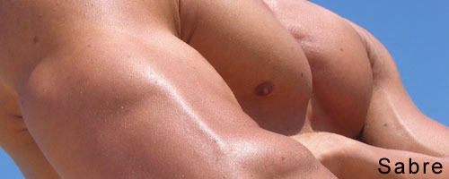
Boy Movie - Straight Boy Seduction - Body Boy Gets Done: At
6' 3" and 214lbs Sabre is a gentle giant. Sabre spends
most of his time in the gym working out, he has been in many
bodybuilding competitions and enjoys showing off his well
sculpted body. He loves showing off all the hard work that
he has put into making his body what it is today.
Modeling
was just a natural step after bodybuilding, its just another
way for Sabre to show off his body and get paid for it. If
you think his body is hot wait until you see his arse, wow.
Sabre really put on a show for the camera and when he came
it was like a water fountain spitting across the room. Check
it out at Boy-Movies.com
|
|
 |
DON'T
FORGET OUR SPECIAL CHRISTMAS COMPETITION !!!
As
a special bonus for affiliates for Christmas, CuriousCash
is offering an extra special for affiliates to amp up the
presents under their trees !
$5
bonus per join sent between the 1st and the 24th of December
!
Affiliates
need send only 35 joins during that same period to ANY of
the 30+ exclusive and original content CuriousCash sites to
qualify for this bonus that will be added to their first January
payment.
Affiliates
who qualify just need to email WebmasterDan on Webmaster@CuriousCash.com
once they have reached the qualifying mark and he will take
care of the rest !
|
|
 |
 |
JAMES
James is from the UK and was drawn to Australia
by the amazing weather and great people. He has traveled through
most of Europe and enjoys playing soccer on the weekends.
One of
his fantasies is very naughty, “A fly on the wall type
scenario” said James. As I was preparing the dvd for
James to watch he had a shower to freshen up, I slid open
the door and his cock was already rock hard. When he came
back into the studio with just a towel his dick pushed through
the towel as he sat down on the couch, very hot!
Click
Here To See More |
 |
SABRE
After many requests from you all, we have
got Sabre back to do a second shoot. This time we took him
down to the beach were his muscle bound body looks at home.
There are heaps of great pics of his hot body all wet in his
tiny white boxer shorts.
What a
sight to see, this hot body boy at the gloryhole. After a
bit of persuasion and a little more money Sabre was all for
the idea. Check out how horny he is once Dave latches onto
his hard cock. He couldn’t help himself but to blow
his hot load everywhere.
Click Here To See More
|
|
 |
How
do I use the Marketing Material Section of CuriousCash ?
Over the past couple of weeks I have found several people
have come to me and informed me the navigation of the Marketing
Material area is hard and confusing to use. When I programmed
this I thought it was straight forward, however now that I
have gone back to it I also feel it is extremely hard to navigate.
Due to this I will be reprogramming this entire section over
the next few weeks. Any MPA3 links you are currently using
will remain the same as they will essentially be the complicated
way to link to the site, and I am going to simplify the whole
section and links to enable much easier use.
My
Checks seem to take some time to process at the bank, why
is this ?
CuriousCash is not an American Operation therefore when we
issue checks the American Bank needs to validate the check
with our Bank and this can take time. To try and expedite
the time from payout to the money being available in your
account we recommend you choose Wire as your preferred payment
method and set your minimum payout amount to $500. If you
do this we will waive the transfer fee. Alternatively we are
looking at better check issues methods and also Epassporte
and Funds2Go.
CuriousCash
has always been on the cutting edge of technology, however
we have not seen any major advances of late, will you be bringing
anything new and innovative to us soon ?
You bet ! We will have 1 new niche site online prior to Internext
as well as a complete revamp of Boy-Movies will also be undertaken
once our streaming server is bedded down 100% . We also have
a few very innovative sites currently in development which
will allow you to market into a new and quickly expanding
market. We will let you know more about this over the next
few weeks as we grow closer to launch.
|
|
 |
Top 10 Tips For New Designers
(By CJ - www.Purve.com)
10) Style Sheets are your best friend
Until DHTML was invented, traditional print designers struggled
with making html do the things they were used to doing in other
software. DHTML is the designers programming language, with
basic tags that control elements across an entire site. Style
Sheets give you flexibility with word and letter spacing, a
variety of 2d & 3d borders on tables, and control over the
exact placement of elements on a page using layers.
9) Keep Everything to build your design assets
Sometimes, you may stumble on a set of filters or effects that
look absolutely amazing, but that don't suit your current design
at all. Make a new document and drag all of those layers into
it, including filters or even a brief explanation of what you
did. Save that document in a 'working' folder and add to it
every time you have an idea that doesn't necessarily fit into
what you are working on at the time. In almost 9 years of designing,
I have around 50 gig of these types of files - and because of
this, I am never short of a design idea, and my employees are
able to use these elements to work in a totally different direction
they may never have thought of. Every element that may shorten
the time it takes you to complete a site, is a valuable designers
asset.
8) Design for your Audience
Perhaps this is more relevant to me as I focus on designing
for women, but I notice often that designers tend to design
what they like rather than trying to put themselves into the
position of the audience who will be surfing, and potentially
spending money, at the site. Presentation (design) is the most
important element of marketing, so if you are making design
choices based on how many letters will fit into a space, you
aren't putting your audience first.
7) Using Photographs in Designs
If you stand in front of a magazine stand and cast your eyes
across the 'designs' of covers, you'll notice the photo on the
front cover controls 99% of the design. Where the photo has
black spots controls text placement, the colors in the photo
influence the colors of text titles and the old saying applies
- a picture tells a thousand words. Perhaps a better example
than tabloid magazines is design magazines - interior design,
architecture, advertising etc. If you have just the right photo,
with just the right text, there is no more effective way to
get your message across.
6) Learn how to compress images effectively
If an image isn't compressed effectively, a site can end up
being 10 times bigger than it needs to be, so compressing pics
is extremely important. Deciding whether an image should be
a gif or a jpeg is something many seem to struggle with, but
there is a simple rule I use to decide how to save an image.
Jpeg is a pixel based compression format, which removes a certain
amount of the pixels from an image based on the jpeg compression
you choose. GIF format uses a web safe color palette of 256
colors, but you can choose exactly how many colors an image
contains to make the size smaller.
The basic rule is that a photo should almost always be jpeg,
and text should almost always be a GIF. Black text on a white
background would be a gif, and when you save it you have the
option to chose colors. While the only 2 colors are black and
white, there are about 4 levels of grey which form the anti-aliasing
around the edge of a letter, so you would set this image at
about 10 colors. Photos which are black and white or which have
few colors may be smaller as a gif than as a jpeg, so save it
as both and check the file size of each to be sure.
5) Consistency creates Continuity
If your site uses a design element on the front page, but uses
an entirely different element on every other page, you may as
well not bother calling it a design. Before you set about building
the content pages of any site, decide on your template by creating
standards in a single document. Decide on a standard bullet
point for displaying point form information, a dividing line
to separate blocks of information, a font and color for main
and secondary titles, and a font, color and size for block text.
Attention to detail is extremely important - like making sure
the tables and navigation are all the same width and positioned
in the same place on the page are the difference between a site
where the surfer flows from page to page, and a site where the
server flows to somewhere else.
4) If you are color blind, stick with safe combinations
80% of a design is controlled by the colors ... the best design
in the world will look like crap if its made up of colors that
clash. There has been much research done into the psychology
of color, and you can find a past article I've written on this
in the archives. Try this experiement with a basic table that
has cellspacing and cellpadding set to 5, 2 colums with several
rows and the border set to 1 pixel #cccccc. Using a WYSIWYG
editor, make each cell a different color, try every combination
until you find one that works. If in doubt, use various shades
of grey with 1 bold highlight color - see www.purvebucks.com
for an example of an effective use of grey's and a normally
offensive color, lime green.
3) Take inspiration from everything around you.
One of my favorite places to get design inspiration is the intro's
of television programs, and the station id's that are dropped
between shows - these have incredible graphics, even if they
are only 5 - 15 seconds long. The News is also an interesting
program to watch, as even the boxes with headlines across the
bottom are a design, with elements most eyes wouldn't notice.
Then of course there are the obvious ones like magazines, ads,
business cards etc. I am a big fan of free postcards that you
find in cafe's, and have collected about 1000 over the years
- these are designed to achieve similar things to a paysite
tour, making them a great place for inspiration.
2) Keep it simple ... and walk before you run.
A major key to being a good designer is knowing how to work
within your limitations. If you aren't yet sure how to implement
your ideas in a clean, aesthetically pleasing way, do something
less complicated. Some of the best designs are little more than
block colors with light grey table borders and a dot next to
every heading.
1) Learn when to say 'that is good enough', so you can finish
more sites.
One of the biggest mistakes made by designers while they are
learning is to spend unnecessary amounts of time nudging a layer
a few pixels to the left or right, deciding on a totally new
design or adding new elements just for the sake of getting all
those ideas into 1 design. If you are aiming towards a career
as a designer, you'll have plenty of time to use bevel, overlay
and outer glow, so you don't need to use every idea in each
design.
Also appeared in
Klixxx
|
|
 |
|
|
|

